
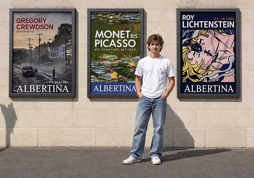
Gregory Crewdson: How Cinematic Photography Shaped My Creative Vision
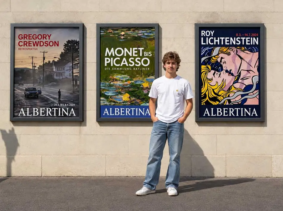
GREGORY CREWDSON: RETURNING TO THE IMAGES THAT TAUGHT ME TO SEE
A journey to Austria, a return to one of my formative photographic influences, and a reflection on how cinematic colour, controlled light and visual storytelling helped shape my commercial photography.
There are certain photographs that remain in your imagination long after you first encounter them. They become part of the way you interpret light, understand colour and recognise the possibilities within a scene.
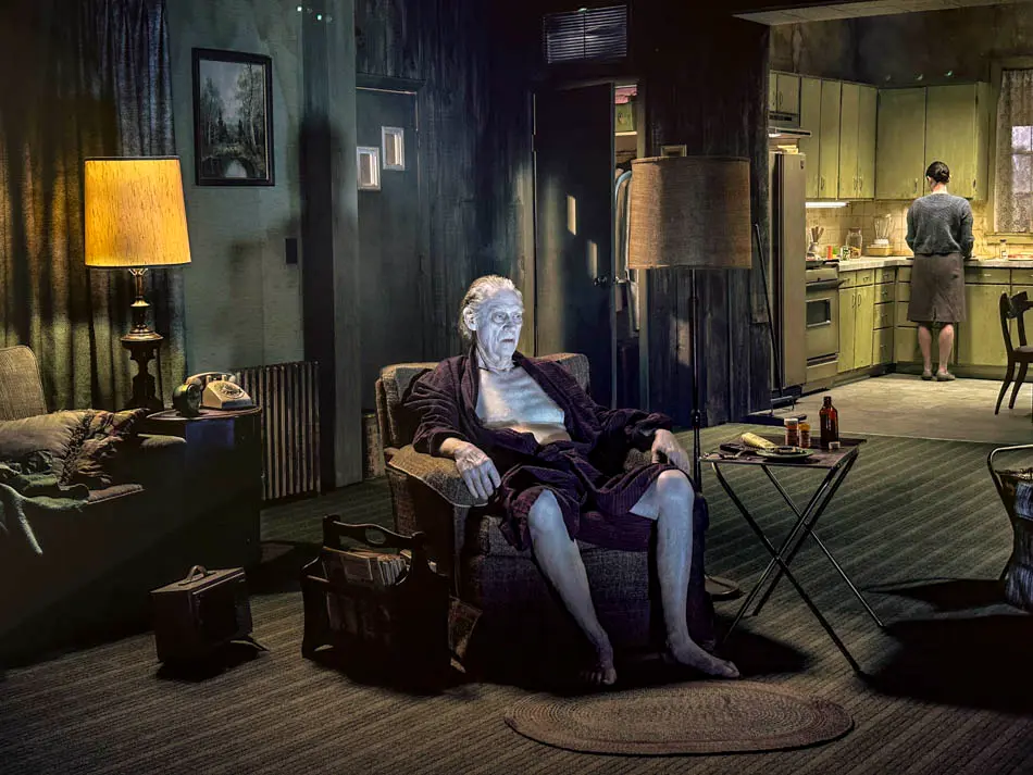
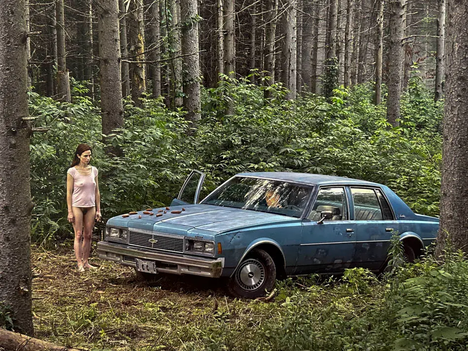
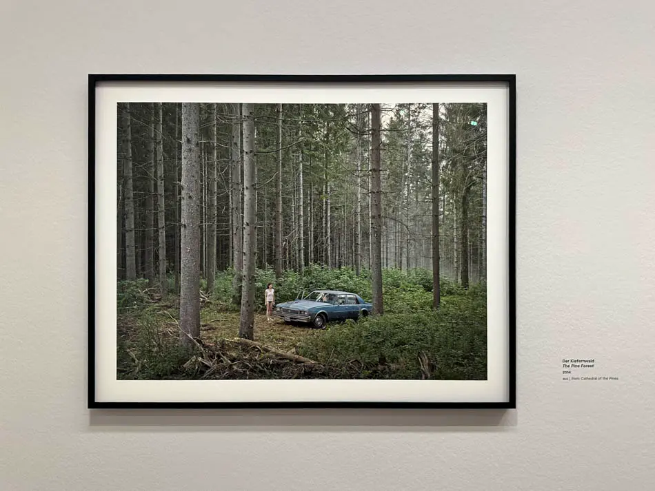
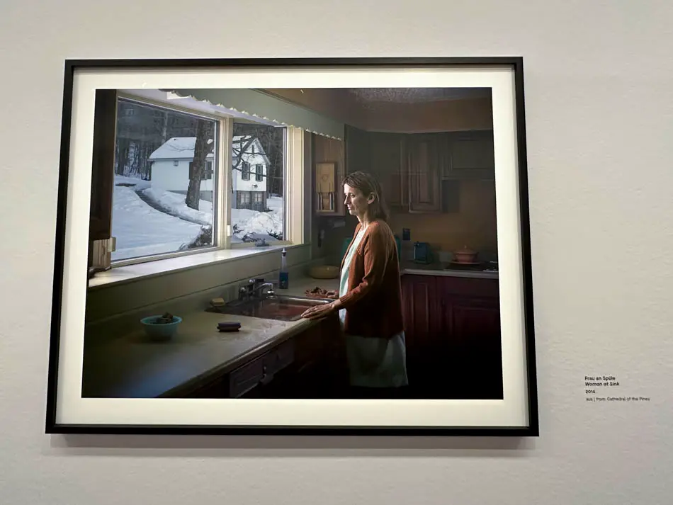
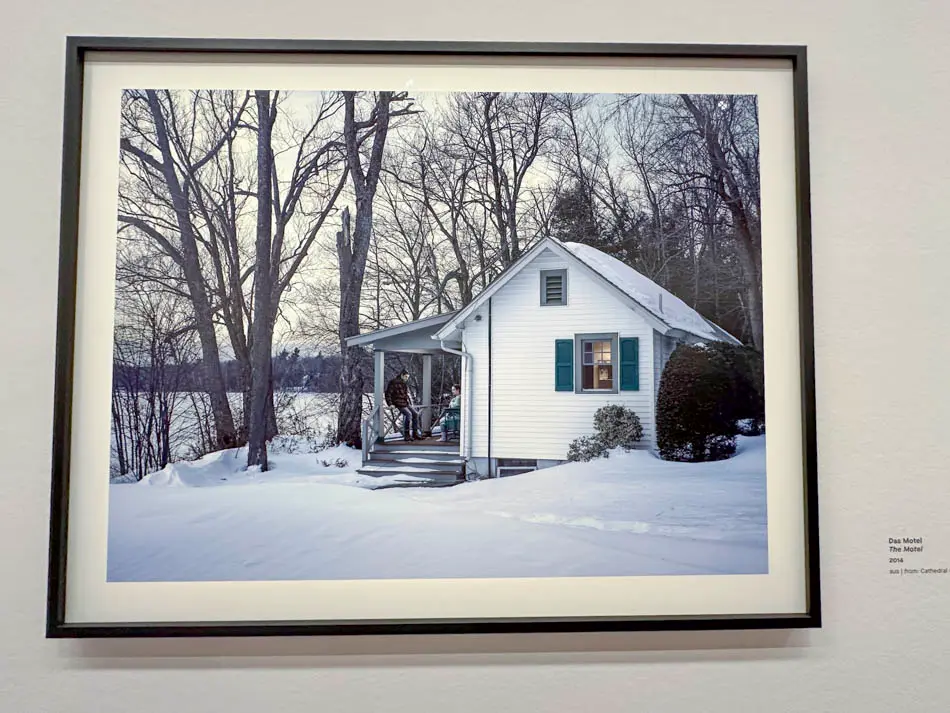
For me, the work of Gregory Crewdson became one of those important influences. His cinematic photography offered something beyond the conventional photographic image: carefully constructed environments, unsettling atmosphere, restrained colour and stories that appeared to exist beyond the boundaries of the frame.
During the development of my photographic style, I became increasingly interested in the relationship between photography and cinema.
Crewdson's use of colour and tonality became one of the visual references that helped inform that direction.
Over time, those influences found their way into my own fashion photography, editorial imagery and commercial advertising campaigns.
They helped me develop a recognisable approach to atmosphere and narrative, contributing to the creative identity that attracted major European clients.
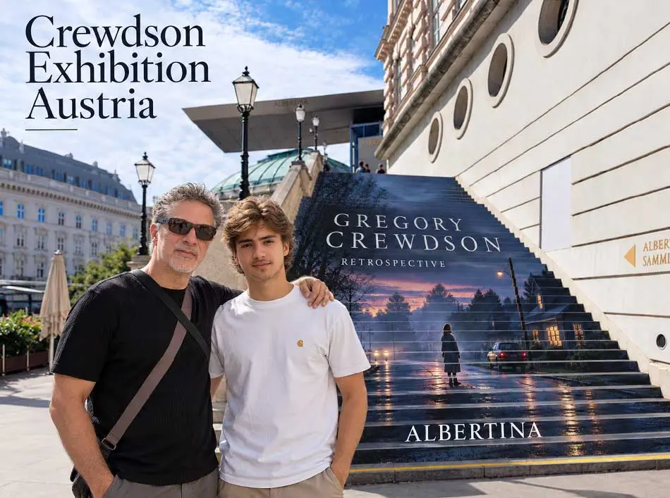
Travelling to Austria to see his work in person was therefore more than an opportunity to visit an exhibition. It was a chance to return to part of my creative history and to consider what I could still learn from it.
RETURNING TO AN EARLY INFLUENCE
I have always believed that photographers should continue looking beyond photography. Painting, cinema, architecture, sculpture and music can all change the way we think about constructing an image.
The journey to Austria offered an opportunity to revisit the work of a photographer whose approach to colour and cinematic storytelling had influenced my own.
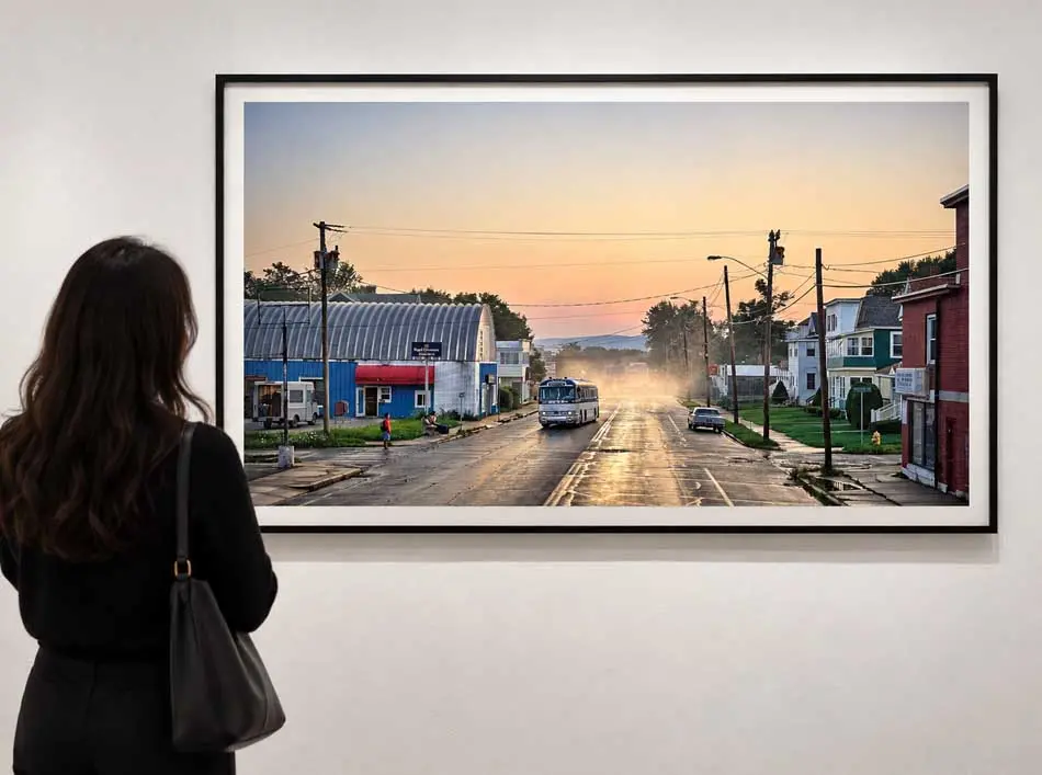
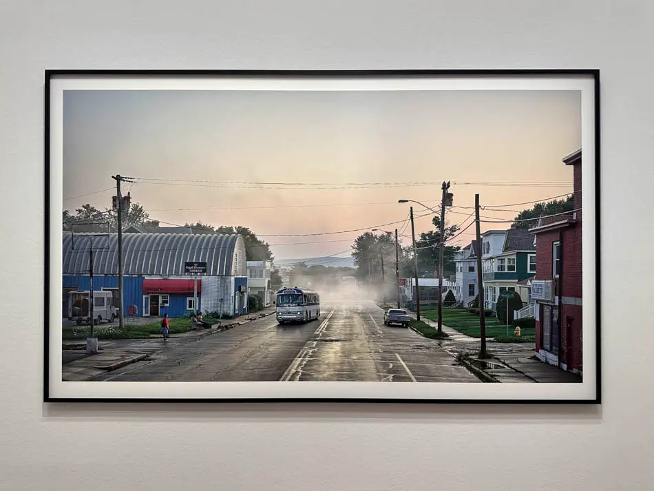
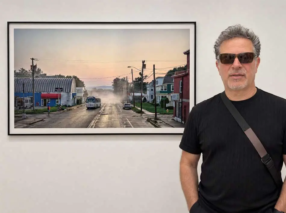
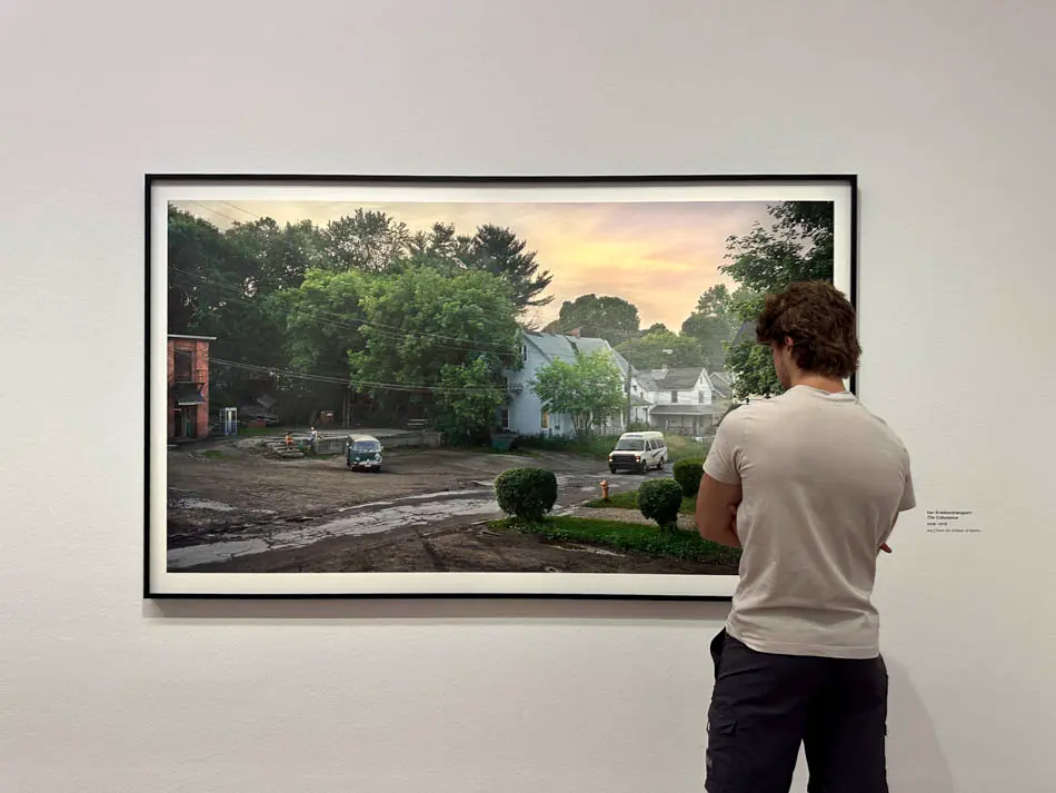
Looking at photographs in books or on screens can introduce us to an artist's visual language. Standing in front of the prints themselves encourages another kind of observation.
I was interested in how the lighting held the compositions together, how colour influenced the emotional temperature of a scene, and how the placement of the human figure affected the story.
These are questions I have considered throughout my own commercial practice, but returning to an early influence can reveal different answers.
WHEN COLOUR BECAME PART OF THE STORY
Colour photography can describe a scene, but it can also determine how that scene feels. This distinction became increasingly important as I developed my own cinematic approach to photographic production.
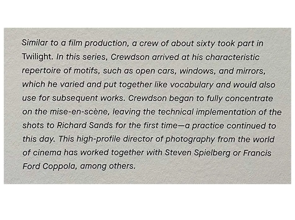
What has always interested me about Crewdson is the way his images suggest something beyond the visible moment.
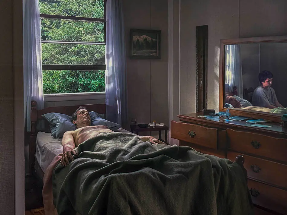
The colours, illumination and environments combine to produce a particular psychological atmosphere.
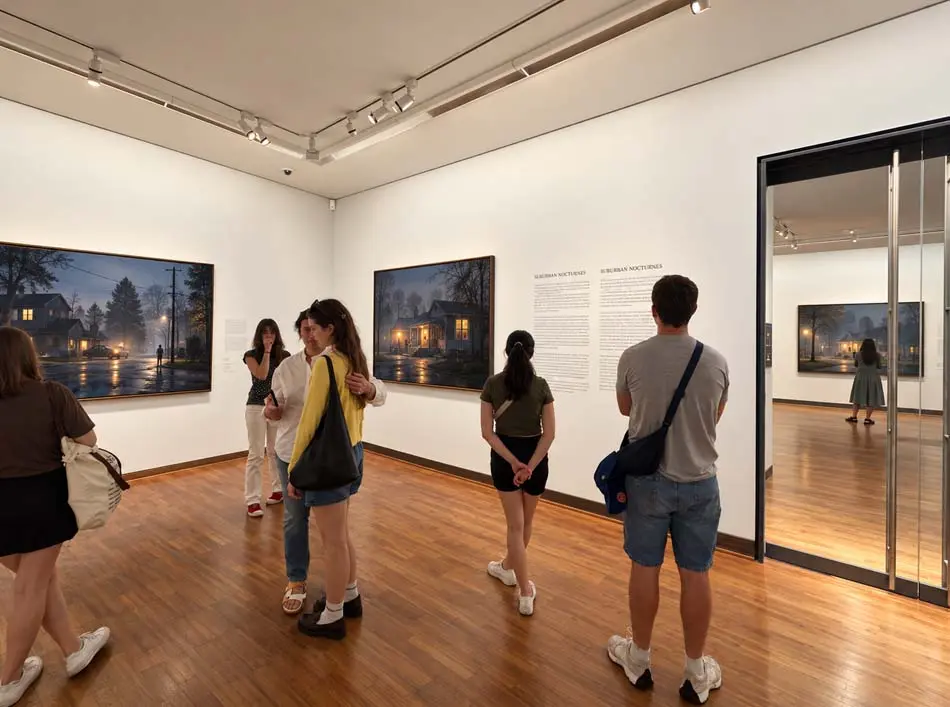
A muted interior can feel uneasy. A cool exterior can create separation or isolation. A controlled area of warmth can draw us towards a subject without explaining everything about the situation.
These relationships helped sharpen my interest in colour tonality in photography. I began thinking about colour less as a decorative finish and more as a deliberate part of the narrative.
COLOUR SHOULD HAVE A PURPOSE
Before deciding how to grade an image, consider what the colour needs to communicate. Is it contributing to calm, unease, intimacy, distance or tension?
Colour grading can support an atmosphere. It cannot substitute for the decisions that establish the atmosphere in the first place.
THE LIGHT THAT HOLDS A STORY TOGETHER
One of the most revealing aspects of studying a carefully constructed photograph is recognising how the viewer's attention has been directed.
Light determines what we see clearly, what remains uncertain, and how the eye travels through the frame.
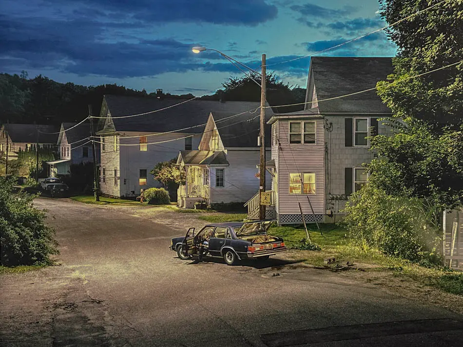
When I study a photograph, I am not immediately interested in identifying the equipment. I want to understand the intention behind the illumination.
Why does one part of the picture attract attention before another? Why has the environment been allowed to remain darker?
What would happen to the narrative if the light were moved or reduced?
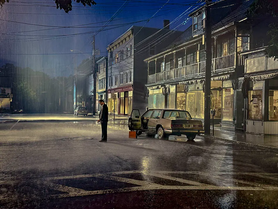
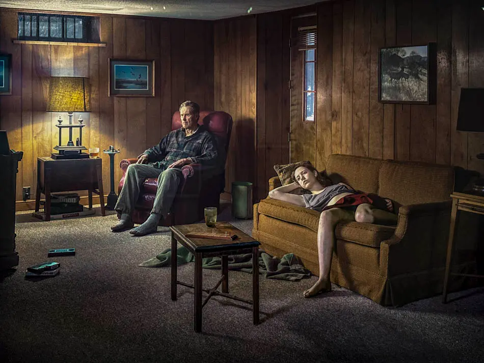
In cinematic lighting, the relationship between illuminated and unilluminated space can be more important than the amount of light used.

YOU CANNOT LIGHT WHAT YOU HAVE NOT SEEN
Before arranging a light, examine the scene. Identify where the photograph already has visual strength, where attention is lost, and where the subject needs separation.
Sometimes the answer is additional illumination. Sometimes it is less light, a change of position, or a different relationship between the subject and the environment.
The camera records the decisions already made.
HOW INFLUENCE BECAME PART OF MY COMMERCIAL WORK
One of the most valuable things I learned from studying artists and photographers was that inspiration only becomes useful when it is interpreted.
It is not enough to admire the appearance of an image. The real opportunity is to understand the decisions that made the image possible.
Throughout my professional work in fashion, editorial and advertising photography, I developed a strong interest in controlled colour, cinematic lighting and images built around atmosphere.
Crewdson was one of the visual influences that contributed to this direction. I was drawn to the way the setting could become an active part of the photograph rather than simply a background for the subject.
I began applying my own interpretation of these ideas to commercial briefs. That meant finding ways to use location, styling, lighting, subject direction and colour as connected elements.
The creative solution had to remain appropriate to the client, the campaign and the audience.
But I wanted each image to carry an identity beyond conventional commercial illustration.
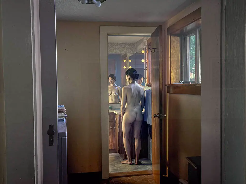
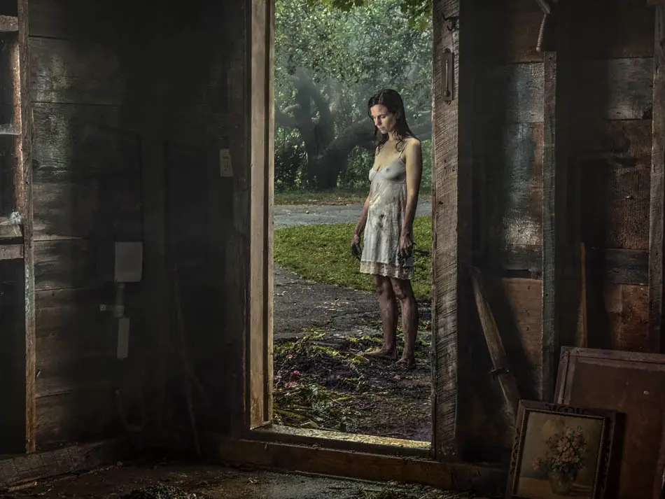
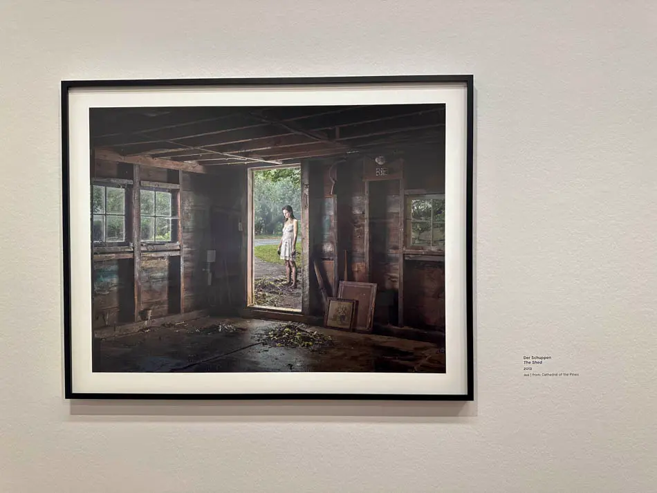
This approach became part of what distinguished my work. Over time, that recognisable visual language helped me attract substantial European commercial clients.
It was not about reproducing Crewdson's photographs. His work was part of a wider education in seeing, interpreting and making creative decisions.
My own photography had to respond to the people, places, stories and commercial demands in front of me.
DEVELOP A RECOGNISABLE VISUAL IDENTITY
A photographic style cannot be built from borrowed visual effects alone. It develops through repeated decisions about subject, light, colour, composition and narrative.
When those decisions become consistent, clients begin to recognise the particular visual approach a photographer can bring to a campaign.
The commercial value lies in the ability to apply that identity to a real brief, not simply to repeat a familiar look.
THE PHOTOGRAPH THAT EXISTS BEFORE THE CAMERA
Looking at carefully staged photography reminds me that a powerful image begins well before the shutter is pressed.
The environment, the subject, the direction of light and the boundaries of the frame are all part of the construction of meaning.
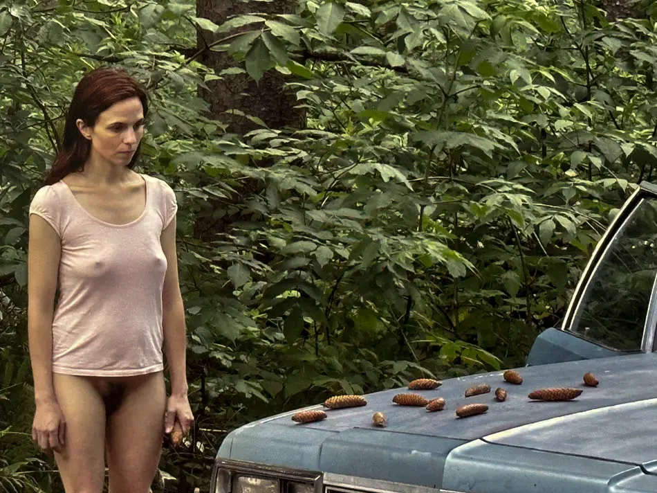
This is something I have become increasingly interested in communicating through my teaching. Photography is not simply the operation of a camera.
It is a sequence of decisions. We notice something, recognise its potential, organise its elements and determine how to translate that recognition into a photograph.
When considering cinematic composition, I look at how a subject relates to the surrounding space.
Does the environment add meaning? Is the subject isolated or connected? Does the viewer understand where to look without being told?
FOUR QUESTIONS BEFORE PHOTOGRAPHING
01 — WHAT HAVE I NOTICED?
Look beyond the obvious subject. Find the relationship, atmosphere or visual tension that interests you.
02 — WHAT HAS VALUE?
Decide which element carries the emotional or narrative significance. Everything else must support it.
03 — HOW SHOULD IT BE ORGANISED?
Consider framing, subject placement, tonal relationships and the direction of the light.
04 — WHAT NEEDS SOLVING?
Identify distractions, unresolved lighting, conflicting colours or elements that weaken the photograph.
These questions reflect my NVOS approach to photographic decision-making: Notice, Value, Organise and Solve.
The purpose is not to make photography formulaic. It is to become more aware of the decisions we are already making.
WHY A SINGLE FRAME CAN SUGGEST AN ENTIRE STORY
A photograph does not need to explain everything. Sometimes its strength lies in allowing the viewer to imagine what happened before the image was made, or what might happen afterwards.
This openness is part of what makes cinematic photography compelling.
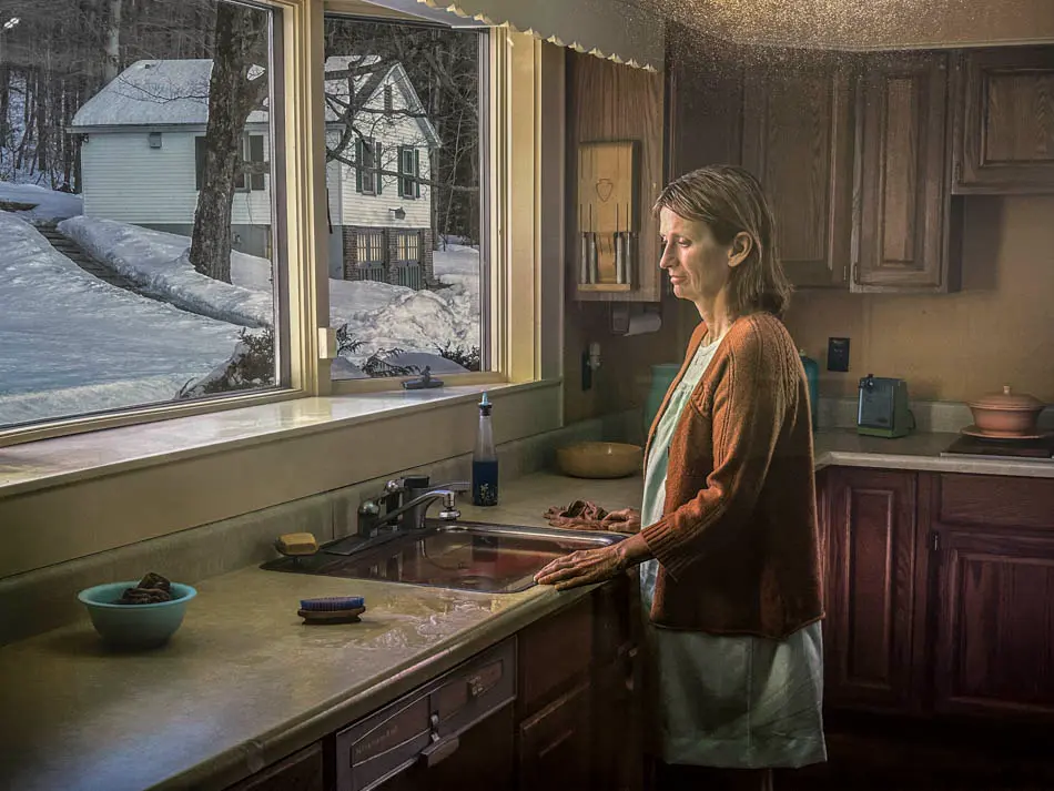
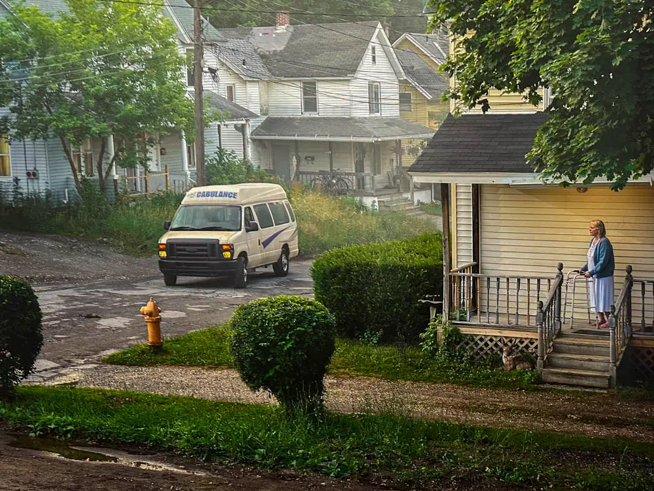
The relationship between a human figure and an environment can transform the photograph.
A person positioned within a large architectural space can suggest vulnerability or isolation.
The same person photographed closer, with a different distribution of light, can create an entirely different emotional response.
This is why the placement of a subject matters so much to my approach to portraiture and fashion photography.
The environment should contribute to the picture, not merely fill the background.

WHAT I LEARNED BY RETURNING TO AN INFLUENCE
The greatest value of returning to an artistic influence is not necessarily discovering something entirely new about the work.
It can be recognising how your own understanding has changed.
When we first encounter an artist, we often respond instinctively. We recognise the atmosphere, emotion or visual character without fully understanding why it affects us.
Professional experience gives us another perspective. We begin to recognise the decisions that sit behind the finished image.
Looking at Crewdson's photography again encouraged me to reflect on the development of my own visual language — from early fascination with cinematic colour and lighting to the creative decisions I later made on commercial productions.

I have never believed that creative development reaches a point where the learning stops.
Experience changes what we notice, but curiosity gives us a reason to keep looking.
The important distinction is between admiring the finished photograph and understanding the thinking that makes it work.
FIND YOUR INFLUENCES. DEVELOP YOUR OWN LANGUAGE.
Study the photographs, paintings, films and ideas that genuinely hold your attention.
Ask what they reveal about light, colour, composition, atmosphere and the human condition.
Then take those discoveries into your own photographs. Interpret them through your own experiences and decisions.
Photography is less about taking photographs, and more about recognising the photograph that exists before the shutter is pressed.
GREGORY CREWDSON: THE INFLUENCE BEHIND MY CINEMATIC PHOTOGRAPHY
A short film from my journey to Austria, reflecting on the images that influenced my colour photography, creative direction and commercial visual storytelling.
Coming to YouTube
The film accompanies this Field Note and explores the relationship between artistic influence, professional experience and the development of a personal photographic identity.
FIVE THINGS I TOOK FROM THIS EXPERIENCE
The value of studying artistic influences lies in what we carry forward into our own creative decisions.
01 — COLOUR HAS EMOTIONAL CONSEQUENCES
Tonality and colour relationships influence the atmosphere of a photograph before the viewer consciously interprets the subject.
02 — LIGHT IS A FORM OF DIRECTION
Lighting controls visual hierarchy. It determines what is revealed, what remains hidden and how the eye moves through the picture.
03 — ENVIRONMENT CAN BECOME NARRATIVE
The relationship between the subject and surrounding space can carry as much meaning as the subject itself.
04 — INFLUENCE REQUIRES INTERPRETATION
A distinctive visual identity develops through understanding and applying ideas, not through repeating another artist's appearance.
05 — CREATIVE DEVELOPMENT NEVER ENDS
Returning to influential work with greater professional experience can reveal new layers of understanding and encourage new photographic decisions.
QUESTIONS FROM THE FIELD NOTE
How did Gregory Crewdson influence James Nader's photography?
Crewdson was one of the artistic influences that informed James Nader's approach to cinematic colour photography, tonal control, atmospheric lighting and constructed visual narratives. Nader developed these influences into his own fashion, editorial and advertising photography.
What is cinematic photography?
Cinematic photography draws on the visual language of cinema, using lighting, colour, composition, environment and subject direction to communicate a narrative or emotional atmosphere within a still image.
How does colour influence visual storytelling?
Colour can create emotional associations, separate subjects from their environment, establish visual hierarchy and contribute to the overall mood of a photograph.
Can artistic influences improve commercial photography?
Yes. Studying art, cinema and photography can broaden a photographer's understanding of lighting, narrative, composition and visual identity. These ideas can then be interpreted for advertising, fashion and editorial briefs.
How can photographers develop a recognisable style?
A recognisable photographic style emerges through consistent creative decisions, repeated practice, studying meaningful influences and developing a personal approach to subject, lighting, colour, composition and visual storytelling.
BEYOND THE PHOTOGRAPH
My work spans fashion photography, commercial advertising, editorial imagery, creative direction and photographic production.
Field Notes is where I explore the thinking, decisions and experiences behind that work, and share what they can teach us about seeing more deliberately.
No Comments